Magic Oven
For this, the second Google UX Design Professional portfolio project, we were tasked with creating a Responsive Web Design in Adobe XD. In completing this course, we learned the basics of responsive website design, learned basics of Adobe XD, and further explored the importance of understanding user needs, behaviors, and motivations.

About the client
"Magic Oven" is a cooking tutorial site that aims to empower users with a vast collection of delicious and easy-to-follow recipes. In order to provide an exceptional user experience for individuals accessing the website from various devices, platforms, and screen sizes, the development team has identified the need for a responsive website design
How might we design a responsive website that ensures the optimal viewing and interaction experience across all devices?
Role: UX Designer, Visual Development
Tools: Adobe XD, Photoshop
Deliverables: Responsive website

Challenges
Given the diverse range of devices available today, including smartphones, tablets, laptops, and desktops, ensuring a seamless user experience across all screen sizes can be quite daunting. Designing a layout that adapts and adjusts according to various devices requires careful planning and testing to guarantee that content is accessible and legible at all times.

Design MethodologyEmpathize
Emphasize Phase in Design Thinking: Creating a Responsive Cooking Tutorial Website
The emphasize phase in design thinking is a crucial step in creating a responsive website for a cooking tutorial platform. This phase involves understanding the needs and desires of the users and identifying the core problems that need to be addressed. To design a successful cooking tutorial website, it is essential to empathize with the users. This involves gaining a deep understanding of their motivations, preferences, and pain points. To achieve this, designers can conduct interviews, surveys, or even observe users directly in their cooking environments.
Identifying User Needs and Goals
During the emphasize phase, the design team identified specific needs and goals of the target audience.
1. Ease of Navigation: Users should be able to browse through recipes, ingredients, and cooking techniques effortlessly. Intuitive navigation and a clear hierarchy of information are essential.
2. Visual Appeal: Users often expect mouthwatering visuals on a cooking tutorial website. High-quality images, videos, and aesthetically pleasing design elements can enhance users' engagement and make the site memorable.
3. Mobile-Friendly Design: Given the increasing reliance on mobile devices, a responsive website that adapts to different screen sizes is fundamental. Ensuring that the cooking tutorial website is accessible and usable on smartphones and tablets is paramount.
4. Clear Communication: Users need explicit and concise instructions. It is important to present the cooking steps, techniques, and ingredient lists in a simple yet informative manner.
5. Community Interaction: Many cooking enthusiasts thrive within a community. Incorporating features such as forums, comments sections, or user-generated content options can foster a sense of belonging and encourage engagement.
By thoroughly understanding the users' needs and goals and prioritizing user-centered solutions, the emphasize phase of design thinking lays the foundation for creating a responsive cooking tutorial website that is both visually appealing and user-friendly. Adhering to this phase ensures that the subsequent stages of ideation, prototyping, and testing are based on a solid understanding of the target users, leading to a successful design solution.

Define
Potential User Needs for Designing a Responsive Cooking Tutorial Website
When designing a responsive website for a cooking tutorial site, it is essential to consider the potential user needs to ensure a seamless user experience. Here are a few key user needs to consider:
Accessible and Responsive Design
Users today access websites using various devices, including smartphones, tablets, laptops, and desktop computers. To address this, the website should have a responsive design, automatically adjusting its layout and content to fit different screen sizes. This ensures that users can easily access the cooking tutorials irrespective of the device they are using, resulting in a positive user experience.
Clear Navigation and User-friendly Interface
An intuitive and user-friendly interface is crucial in providing a seamless experience for users. The website should have well-organized menus, clear navigation paths, and easy-to-find search functions. This enables users to quickly find and access the specific cooking tutorials they are interested in, enhancing user satisfaction.
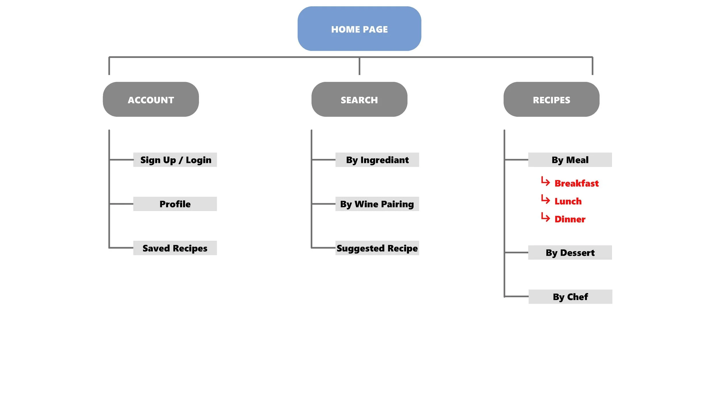
A well-defined and thoughtfully structured hierarchy ensures navigational efficiency, aids content prioritization, provides a seamless user journey, and enables responsive navigation design. Incorporating a clear site hierarchy will be a fundamental aspect of our strategy, delivering an exceptional user experience across all devices.

This chart shows that 81% of adults own smartphones. Depending on the type, there are varying screen sizes that would be needed to be prepared to design for.

This chart shows that 74% of adults own desktops/laptops and just over 50% owns some form of tablet.
Ideate
The ideate stage is a crucial step in creating a responsive website. It sets the foundation for the entire design process by brainstorming and generating creative ideas to meet the needs and goals of the website.
During this stage, designers and developers collaborate to explore various concepts, features, and functionalities that will enhance the user experience. The goal is to come up with innovative solutions to design challenges and ensure that the website is adaptable across different devices and screen sizes.
In the ideate stage, the team begins by conducting thorough research and analysis of the target audience, including their preferences, behaviors, and expectations. This research helps generate ideas that resonate with the users and align with the purpose of the website.
Brainstorming sessions are then conducted where team members contribute their thoughts, concepts, and suggestions. This encourages a diverse range of ideas and encourages out-of-the-box thinking. Sketches, wireframes, and mood boards are commonly used tools during this stage to visualize concepts and refine ideas.
Iterative feedback loops are essential in the ideate stage. The team frequently reviews and critiques the proposed ideas, making adjustments and enhancements along the way. User feedback and usability testing can also be incorporated to validate the ideas and ensure they meet user expectations.
Another important aspect of ideation is considering the latest design trends and technologies. Designers need to stay updated on new techniques, frameworks, and tools to create a website that is not only responsive but also visually appealing and up-to-date with current industry standards.
Throughout the ideate stage, the team considers the hierarchy of information, navigation patterns, typography, color palettes, and other design elements to create a coherent and intuitive user interface. They also explore options for accommodating different screen sizes, ensuring that the website responds effectively across desktops, tablets, and mobile devices.
In addition to functionality, the team also considers the emotional aspects of the user experience. They strive to create an emotional connection with the users through thoughtful design choices, engaging visuals, and clear messaging.
The ideate stage is an exciting and dynamic part of the website creation process. It is a time for exploration, innovation, and creativity. By investing time and effort in this stage, the team lays the groundwork for a responsive website that delights users and achieves its intended goals.


Prototype
In the creation of a user-friendly cooking tutorial website, the prototype phase is crucial. It involves building a simplified version of the site that showcases its main features and design. This prototype is used for testing and gathering user feedback to improve the final product. It also allows developers to check how the website performs on different devices like desktops, tablets, and mobiles. By streamlining the prototype phase, developers can save time and resources, leading to a more efficient development process and a website that meets user needs.

Desktop 1920x1080

Tablet 12.9 1024x1366

Mobile 428x926
Test
The Test Phase of Creating a Responsive Website for a Cooking Tutorial Site
In the process of developing a responsive website for a cooking tutorial site, the test phase plays a crucial role in ensuring a seamless user experience across various devices and screen sizes. This phase allows us to identify and address any issues or bugs before the site goes live.
Testing Methodologies
Several testing methodologies can be employed during the test phase to ensure the website's responsiveness:
1. Mobile Testing: Given the increasing use of mobile devices for accessing websites, it is essential to test the site's responsiveness on various mobile devices, including smartphones and tablets. This involves checking how the site adapts to different screen sizes, whether the content is readable, and if the navigation remains easy to use.
2. Cross-Browser Testing: To ensure compatibility across multiple browsers, it is crucial to test the website on various popular browsers such as Chrome, Firefox, Safari, and Edge. This helps identify any inconsistencies in design, layout, or functionality that may arise due to different rendering engines.
3. Feature Testing: The cooking tutorial site may include interactive features such as recipe search, videos, and user comments. Each of these features needs to undergo rigorous testing to ensure they function as intended on all devices. For example, video playback should be smooth and responsive without any buffering issues.
4. Performance Testing: Responsiveness is not solely about visual aspects; it also includes site performance. During performance testing, we assess the website's speed, load times, and overall performance on different devices and network conditions. This helps optimize the site's performance and ensures a satisfactory user experience.
Test Scenarios
Various test scenarios can be executed during the test phase to cover different aspects of website responsiveness. These include:
1. Viewport Testing: Verifying that the website correctly adapts to different viewport sizes, ensuring that content is neither too cramped nor too spread out.
2. Navigation Testing: Checking the usability and responsiveness of navigation menus on different devices, ensuring that users can easily access the site's various sections.
3. Image Testing: Assessing how images respond to different screen sizes and orientations. This includes checking for proper scaling, aspect ratio preservation, and overall visual appeal.
4. Form and Input Testing: Testing various forms and input fields to ensure they display properly and can be easily interacted with on all devices. This includes checking for appropriate keyboard layouts on mobile devices.
5. Page Load Testing: Evaluating the website's load times on different connections and devices, making sure the site loads quickly and efficiently.
Bug Tracking and Documentation
Throughout the test phase, it is essential to maintain a detailed record of any bugs, issues, or suggestions for improvement. This allows the development team to track and prioritize fixes and ensure that nothing falls through the cracks. Documentation also serves as a valuable resource for future maintenance and updates.
In conclusion, the test phase of creating a responsive website for a cooking tutorial site is vital to guarantee a seamless user experience across different devices and browsers. By employing various testing methodologies and executing essential test scenarios, potential issues can be identified and resolved, ensuring a high-quality and responsive website.
Takeaways
The desktop user flow of the website starts by capturing the attention of visitors with a captivating homepage. The website design incorporates enticing high-quality food images, to entice users to explore further, a clear navigation menu that allows them to easily browse different sections or categories of cooking tutorials, such as appetizers, main dishes, desserts, etc.
This intuitive navigation ensures that visitors can quickly find what they are looking for.
- Upon selecting a category, users are directed to a page displaying a variety of cooking tutorial options within that specific category.
- Each tutorial is displayed as a visually appealing thumbnail image accompanied by a short description.
- When a user clicks on a specific tutorial, they are taken to a dedicated tutorial page. There, the user is introduced to step-by-step instructions, accompanied by corresponding images or videos, to guide them through the cooking process. This page should be well-organized and easy to follow, ensuring that users can easily navigate between different steps.
- To enhance the user experience, a cooking timer or a progress bar can be incorporated into the tutorial page, allowing users to keep track of their progress and estimated cooking time. Additionally, a section for user comments or reviews may be included, enabling visitors to share their experiences, ask questions, or provide feedback.
- Throughout the user flow, it is important to incorporate responsive design elements that ensure a seamless experience across different devices. This usability adaptation allows users to access the website from various screen sizes, including desktops, laptops, tablets, or smartphones, without any loss of functionality.
In conclusion, the user flow of a cooking tutorial website involves captivating users with an enticing homepage, guiding them through categories to find specific tutorials, providing step-by-step instructions on dedicated tutorial pages, and incorporating interactive features to enhance engagement. Creating a user-friendly and visually appealing desktop experience ensures that visitors can easily tell their culinary stories and explore the vast world of cooking online.
